Part 2 of this article describes how to create hexagonal shot charts in Tableau. If you’re interested in retrieving the data yourself, you can go back to Part 1 to read how. You can also download the dataset from data.world using this link:
Download dataset
This article is written while using Tableau 2019.4.1.
In Part 1 of the article, we left things off after importing the data into Tableau and plotted every single shot onto the canvas, but it can be hard to identify any patterns with a visualization like this. Dividing the court into hexagons can help us in that, as we can analyze the shots in discrete areas where we can add colour and sizing to give us more context.
Adding a Background Image
Before we go into the actual building of the visualization, let’s add a background image representing a basketball court, so we can better identify how the shots are distributed. You can click on the image below and save it.

Let’s start again by plotting all the shots onto a blank canvas. *
* Note that we have to flip around the x-coordinates. The left side on the court from the perspective of the offensive player should be shown on the right-side of the chart. So we have to create a separate calculated field with the formula: -[LOC_X]. We’ll call it [LOC_X (minus)].
- Click on Maps -> Background Images -> <data source name>
- Click on Add Image and Browse to the relevant image.

- Set
LOC_X (minus)as the X Field, and set the Left / Right coordinates to-250 and 250. - Set
LOC_Yas the Y Field, and set the Bopttom / Top coordinates to -52 to 418.
Your visualization should now look something like this:

The image seems to match the shot location coordinates, with a clear separation at the 3-pt line (shots are very rarely taken when the player is positioned on the 3-pt line).
Dividing the court into hexagons
We can use the HEXBINX and the HEXBINY functions in Tableau to divide the shots into hexagons.
- Create a parameter called
[Size], with which we can control the size of the bins. The parameter should allow values between 0 and 1. The lower the value, the larger the bins. For now, we’ll set the default value to 0.2 - Add the calculated field
[Hexbin X]andHexbin Y:
// Hexbin X: note the minus sign to switch the left / right coordinates
- HEXBINX([LOC_X] * [Size], [LOC_Y] * Size)

// Hexbin Y
HEXBINY([LOC_X] * [Size], [LOC_Y] * Size)- Convert
[Hexbin X]and[Hexbin Y]into dimensions. - Remove
[GAME_ID]and[GAME_EVENT_ID]from the Detail Shelf (if applicable). - Add
[Hexbin X]and[Hexbin Y]to the Details Shelf. - Make sure that the aggregation for
[LOC_X]and[LOC_Y]are set to Average instead of Sum.
Our chart should now look something like this. Play around with [Size] parameter to see how the distribution of the court changes. The lower the value, the more each circle covers a larger area of the court.

Unfortunately, Tableau doesn’t come with a hexagon shape out-of-the-box, so you’ll have to download one and add it to your Custom Shapes. You can download one here: https://datavizardry.wordpress.com/wp-content/uploads/2020/01/hex.png.
Change the shape to a hexagon, adjust the size, and you should have something like this:

There is a problem with this approach however. As we are calculating the average x and y coordinates for each hexagons, they are not plotted at their central point, so there are plenty of gaps and overlaps between the shapes.
To rectify this problem, we add [Hexbin X] and [Hexbin Y] to the Columns and Rows shelf. Convert both fields to Continuous Dimensions. Adjust the size, and we can see that the shapes are now properly tessellated, as Tableau plots the hexagons correctly at their central point.

But now we face a couple of different issues:
- The background image has disappeared.
- The values on the scale have changed.
To reactivate the background image, we need to change the Field X and Field Y settings to point to our new Hexbin calculated fields. Make sure to redefine the coordinates in the Left/Reight and Bottom/Top fields:

Now we need to adjust our Hexbin calculations to fit the scale. To do so, we can simply divide the existing fields by [Size]:
// Hexbin X: note the minus sign to switch the left / right coordinates
- HEXBINX([LOC_X] * [Size], [LOC_Y] * [Size]) / [Size]

// Hexbin Y
HEXBINY([LOC_X] * [Size], [LOC_Y] * [Size]) / [Size]
Remove borders, gridlines and scales accordingly, and there you go! We now have a gorgeous pattern of hexagons laid out out over an NBA court.

Adding FGA (Field Goal Attempts) to Size
Now that we have laid the groundwork, we can add in the volume and efficiency metrics by using size and colours. The primary fields we will use here are [SHOT_MADE_FLAG] and [SHOT_ATTEMPTED_FLAG]. I usually rename these fields to [FGM] and [FGA] to match the common abbreviations / terminology used for these metrics (field goals made and field goals attempted).
Before we move on, let’s filter on a specific player. I will use James Harden as my example, as he is the player who attempted the most shots during the season 2018-19.

To visually show the number of shot attempts within each area, we can add [FGA] into the Size shelf. How you decide to set the sizes depends on your analysis and narrative, but these are the settings I’ve used:

So I set the End Value to 10. There are two reasons why I set a End Value:
- If you don’t set an End Value, you’ll get a different Size legend when you filter on different players, so you can’t compare sizes between players.
- Because the restricted area in the paint is a relatively small area, most players will have taken the most shot attempts by far in one of the areas in the restricted area. Therefore setting an end value that is not too high will ensure that most of the hexagons are not too small.
I also set the ‘Sizes vary’ drop-down to ‘By range’, and set the Smallest value to a very small size (the slider is set juuuust slightly to the right). The hexagons that contain only 1 shot attempt will be barely larger than a dot, so these are visible but will hardly draw your attention. In some versions, I even filter out the hexagons that contain only 1 shot attempt.

See the above charts to see what the impact is of these adjustments.
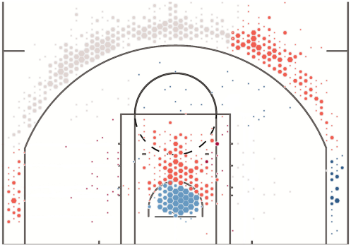
In the top left we see James Harden’s shot chart with the default size settings. In the bottom left we see Jared Dudley’s shot chart with the default size settings. If you didn’t know better, you might think that Dudley has actually shot more than Harden, even though Harden has 1,908 shot attempts compared to 239 for Dudley! Also, the hexagons in the 3-point area in Harden’s chart are barely larger than dots. Would you have guessed that 53.9% of Harden’s shot attempts are taken from 3-point range?
Contrast that to the charts on the right, where the sizes are adjusted as described above. We can now clearly see that Harden has attempted a lot more shots than Dudley. And his tendency to shoot 3-pointers pops out a little bit more now.
But aren’t these settings a bit arbitrary? Yes they are. I’m sure that are smarter ways to define the sizes, but these settings suit my purposes for now without taking too much time. Feel free however to play around with the sizes to fit your own analysis or narrative.
Adding Shooting Efficiency to Colour
Now we want to add some colours to the charts that tells us how efficient a player is within certain areas of the court, compared to the average player. We will take the following steps to make this analysis:
- Divide the court into larger areas (shot zones).
- Calculate the field goal percentage (FG%) within each shot zone for the individual player.
- Calculate the field goal percentage (FG%) within each shot zone across the entire league.
- Compare the results of the individual player with the league average.
1. Divide the court into shot zones
When we analyse individual players, a lot of the hexagons on the chart will only contain 1 or 2 shot attempts, so calculating the shooting efficiency on that level of detail is not meaningful. Instead we will divide the court into larger areas. It is possible to define your own custom areas using the [LOC_X] and [LOC_Y] fields, but for this exercise, we will simply use the shot zone that are already defined within the data.
We’ll create the calculated field [Shot Zone]:
[SHOT_ZONE_BASIC] + ' - ' + [SHOT_ZONE_AREA]Add [Shot Zone] to the Colour shelf in one of the earlier charts we’ve built, and we can quickly identify how the areas are defined on the court:

2. Calculate the FG% within each shot zone for each individual player
To calculate the FG% within each shot zone, we will need to use a level-of-detail calculation, since we also have the [Hexbin X] and [Hexbin Y] dimensions in the viz. We can use either an EXCLUDE or FIXED LOD.
First we calculate the regular [FG%]:
SUM([FGM]) / SUM([FGA])Then we can reuse [FG%] in our LOD calcs:
// using EXCLUDE
{ EXCLUDE [Hexbin X], [Hexbin Y]: [FG%] }

// using FIXED
{ FIXED [Shot Zone], [PLAYER_ID]: [FG%] }
Both LODs will return the same result within the context of our current analysis, but they can behave differently depending on what you want to do further on. For now, consider the following general guidelines:
EXCLUDE should perform better than FIXED in this use case (though I wouldn’t worry too much about that on a 200K row dataset), as the FIXED calculation will calculate the FG% of every player and every zone in the dataset before filtering on a specific player, whereas the EXCLUDE will filter on the player first before calculating the FG%. Also, the FIXED calculation only works correctly when you are analyzing a single player.
On the flip side, the EXCLUDE calc can potentially return different results as you start adding other dimensions into the viz.
The best option in my opinion would be to Fix the calculation on [Shot Zone] and add the[PLAYER_NAME] filter to context. However, since we want to calculate the league average FG% in the next step, we cannot add the [PLAYER_NAME] filter into context, so this option is not available to us.
3. CALCULATE THE FG% WITHIN EACH SHOT ZONE across the entire league
To compare the player’s FG% with the league average FG%, we have to use another LOD calc first. This one needs to be a FIXED calculation, as we want to calculate the average FG% before filtering out the player:
{ FIXED [Shot Zone]: [FG%] }4. Compare the results of the individual player with the league average
Create the calculated field [FG% Delta]:
[FG% by zone & player] - [FG% by Zone]Add the new field into the Colour Shelf. For reasons similar to the ones for size, I don’t use the default settings, but instead I define custom Start and End values.
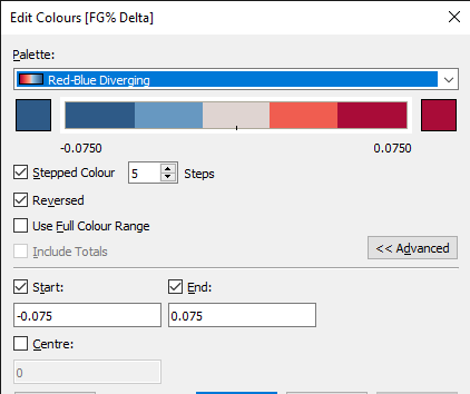
One other thing you might want to adjust is to fix the x and y axes to avoid the court dimensions changing whenever you select a different player.
After we apply all the settings to James Harden’s shot chart, this is how it might look like in the end:

Wrapping Up
These shot charts are not perfect. The sizes and colours could probably be defined in a smarter way than what I’ve done here. And you might have noticed that some of the hexagons contains two different shot zones, so these areas have multiple hexagons stacked on top of each other. To divide the court in such a way that each hexagon consists of one, and only one, shot zone will take a more intricate approach than I’ve taken.
Despite these warts however, I hope that you have enjoyed this article and have found it to be useful. I certainly had a lot of fun during this whole process — from data collection to data visualization to writing the article — plus I also learned quite a few things myself. In the end, working with data is a continuous process of learning and iteration, so I’ll be happy to see if anyone can improve upon the basics I’ve described here.

Hi Daniel,
First of all, thanks a bunch for this neat and easy step-by-step guide! As a new Tableau user, the insights you post really help with learning all the features.
However, I seem to come across one issue. For some reason I cannot figure out how to enable sizing with FGA. When hovering the hexagons it is clear that they only measure 1 FGA per hexagon. Do you have any idea as to how I can enable Tableau to show several attempts from the same position?
Best regards,
Lasse
LikeLike
Hi Lasse,
Thanks for the compliment!
Anyway, the hexagons should contain all the shots attempted in that area, so I’m not sure what is going on in your case. I’ll probably need some more information. Is it ok if I send you an email, so you can send me some screenshots or the workbook?
LikeLike
Hi Daniel,
Great blog! This walkthrough was overall very helpful but I am running into a few problems. My first problem is that I can’t seem to calculate the FG% for the entire zone for a player or team, it just gives the % for the hexagon I hover over. Any ideas for what is going wrong? Please feel free to email me if that is easier than responding here!
Best,
Bobby
LikeLike
Hi Bobby,
Thanks for your comment! You need to make sure you’re using a level-of-detail calculation if you want to calculate the % within the entire zone.
By the way, I’m not sure how I can find your e-mail address, but feel free to e-mail me at daniel.teo@datavizardry.com if you need any further help.
Regards,
Daniel
LikeLike
Hi Daniel,
For some reason, my background image does not appear on my dashboard? Any suggestions.
LikeLike
Hi Daniel,
This and the previous posts has been of incredible help to me, however I seem to be stucked in the part where the court is divided into hexagons. I have no issues creating the parameter or the calculated fields but nothing seems to happen when I aplied them to the detailes shelf and I start playing with the parameter, in fact it looks quite messy and nothing like yours.
Any idea on why it might happen?
Regards
Elías
LikeLiked by 1 person
I’m stuck on the same step. For some reason, when I pull [Hexbin X] abd [Hexbin Y] to columns and rows, the hexagons still overlapped and with some gaps. Any ideia what’s going on?
LikeLike
I’m having the same issue When I pull [Hexbin X] and [Hexbin Y] to columns and rows, the hexagons still overlapped and with some gaps, plus I have a bunch of new axes.
LikeLike